Registry of Tests and Metrics
Core package (basic functionality). Data Analysis
Point Estimates
cd_1_1_Mean
- Technical name: cd_1_1_Mean
- Description: Mean. Average value for the selected column
- Tags: core, data, scalar
- Requirements:
typing,pandas - Notes: -
Execution Logic
The ratio of the sum of all values in the column to the number of values. * Only for columns with numeric data. * If there are missing values in the column, they are excluded from consideration.
Input Parameters
df: dataset with data for analysis (dataframe)
field_column: name of the column for calculation (column)
higher_is_better: Flag for traffic light configuration: higher metric value is better (True) / worse (False) (bool)
threshold_yellow: yellow threshold for traffic light
threshold_red: red threshold for traffic light
Results
Graph rendering engine: not applicable, as the result is a scalar expression (number).
Output (long): None
Output (short): Number: mean value
Output example (picture): not applicable, as the result is a scalar expression (number).
cd_1_2_Median
- Technical name: cd_1_2_Median
- Description: Median. The median value for the selected column
- Tags: core, data, scalar
- Requirements:
typing,pandas - Notes: -
Execution Logic
The number that divides the ordered set of values in the selected column into two equal parts. * Only for columns with numeric data.
* If there are missing values in the column, they are excluded from consideration.
Input Parameters
df: dataset with data for analysis (dataframe)
field_column: name of the column for calculation (column)
higher_is_better: Flag for traffic light configuration: higher metric value is better (True) / worse (False) (bool)
threshold_yellow: yellow threshold for traffic light
threshold_red: red threshold for traffic light
Results
Chart rendering engine: not applicable.
Output (long): None
Output (short): Number: median value
Output example (picture): not applicable.
cd_1_3_Mode
- Technical name: cd_1_3_Mode
- Description: Mode. Mode and N popular values of the column
- Tags: core, data
- Requirements:
typing,pandas,plotly.graph_objects - Notes: -
Execution Logic
The most frequently occurring value in the selected column. * For columns with any data type. * If there are missing values in the column, they are excluded from consideration.
Input Parameters
df: dataset with data for analysis (dataframe)
field_column: name of the column for calculation (column)
top_col_number: Number of popular column values to display
Results
Chart rendering engine: plotly.js
Output (long): Barchart
-
xaxis: values (N most frequently occurring values in the column)
-
yaxis: frequency of occurrence of the value
Output (short): None
Output example (picture):

cd_1_4_Min
- Technical name: cd_1_4_Min
- Description: Min. Minimum value in the selected column
- Tags: core, data, scalar
- Requirements:
typing,pandas - Notes: -
Execution Logic
Minimum value in the selected column.
* Only for columns with numeric data.
* If there are missing values in the column, they are excluded from consideration.
Input Parameters
df: dataset with data for analysis (dataframe)
field_column: name of the column for calculation (column)
higher_is_better: Indicator for traffic light configuration: higher metric value is better (True) / worse (False) (bool)
threshold_yellow: yellow threshold for traffic light
threshold_red: red threshold for traffic light
Results
Chart rendering engine: not applicable
Output (long): None
Output (short): Number: minimum value in the column
Output example (picture): not applicable.
cd_1_5_Max
- Technical name: cd_1_5_Max
- Description: Max. Maximum value in the selected column
- Tags: core, data, scalar
- Requirements:
typing,pandas - Notes: -
Execution Logic
Maximum value in the selected column.
* Only for columns with numeric data.
* If there are missing values in the column, they are excluded from consideration.
Input Parameters
df: dataset with data for analysis (dataframe)
field_column: name of the column for calculation (column)
higher_is_better: Flag for traffic light configuration: higher metric value is better (True) / worse (False) (bool)
threshold_yellow: yellow threshold for traffic light
threshold_red: red threshold for traffic light
Results
Chart rendering engine: not applicable
Output (long): None
Output (short): Number: maximum value in the column
Output example (picture): not applicable.
cd_1_6_Weighted_Prob
- Technical name: cd_1_6_Weighted_Prob
- Description: Weighted Probability. Weighted probability based on model predictions
- Tags: core, data, scalar
- Requirements:
typing,pandas - Notes: -
Execution Logic
For each record (row), we calculate \(score*weight\), then sum the resulting numbers.
* The output is a single number - the WP value.
Input Parameters
df: dataset with research data (dataframe)
predict_column: name of the column with model score (column)
weight_column: name of the column with weights (column)
higher_is_better: Flag for traffic light configuration: higher metric value is better (True) / worse (False) (bool)
threshold_yellow: yellow boundary of the traffic light
threshold_red: red boundary of the traffic light
Results
Chart rendering engine: not applicable
Output (long): None
Output (short): Number: WP value
Output example (picture): not applicable.
cd_1_7_Null_count
- Technical name: cd_1_7_Null_count
- Description: Null count. Number of Null values in the selected column
- Tags: core, data, scalar
- Requirements:
typing,pandas - Notes: -
Execution Logic
Number of Null values in the selected column.
Input Parameters
df: dataset with data for analysis (dataframe)
field_column: name of the column for calculation (column)
threshold_yellow: yellow threshold for the traffic light
threshold_red: red threshold for the traffic light
Results
Chart rendering engine: not applicable
Output (long): None
Output (short): Number of Null values in the selected column
Output example (picture): not applicable.
Basic Dataset Assessments
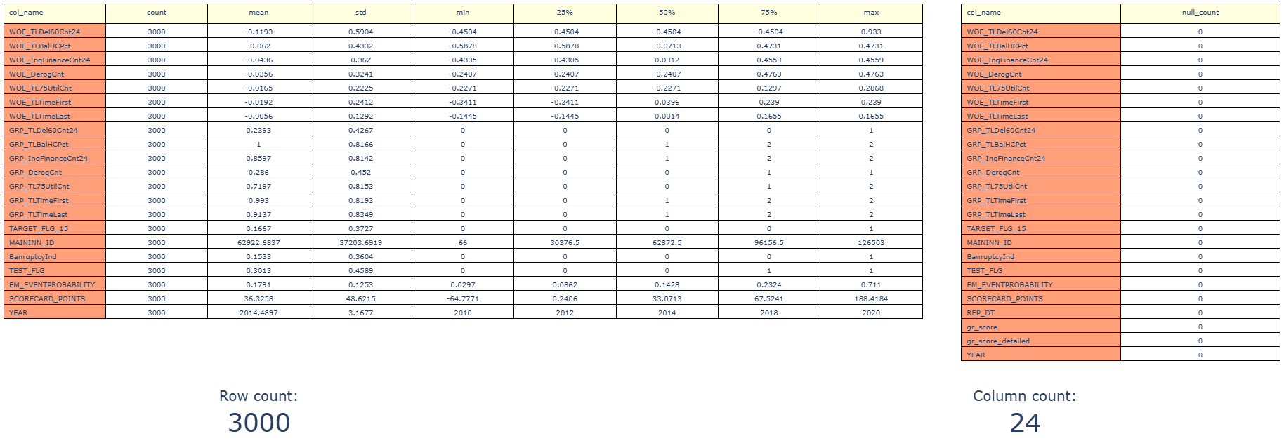
cd_2_1_Df_Stats
- Technical name: cd_2_1_Df_Stats
- Description: Df Statistics Table. Basic statistics for a dataframe
- Tags: core, data
- Requirements:
pandas - Notes: -
Execution Logic
The following are displayed:
- number of rows and columns in the df
- number of missing values in each column
- for each column with numerical data: count, mean, standard deviation, min, max, percentiles: 25, 50, and 75.
Input Parameters
df: Data object for calculation (dataframe)
Results
Chart rendering engine: plotly.js
Output (long): Table with basic statistics for columns
Output (short): - Number of rows in the dataframe - Number of columns in the dataframe
Output example (picture):
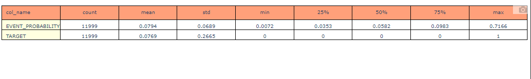
cd_2_2_Df_Stats_features
- Technical name: cd_2_2_Df_Stats_features
- Description: Statistics Table for Selected Columns. Statistics for selected columns
- Tags: core, data
- Requirements:
pandas - Notes: -
Execution Logic
Displays: count, mean, std, min, max, percentiles: 25, 50 and 75 for selected columns
Input Parameters
df: Data object for calculation (dataframe)
field_columns: List of column names for analysis, comma-separated (multi-column)
Results
Chart rendering engine: plotly.js
Output (long): Table with basic statistics for columns
Output (short): None
Output example (picture):
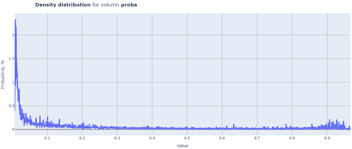
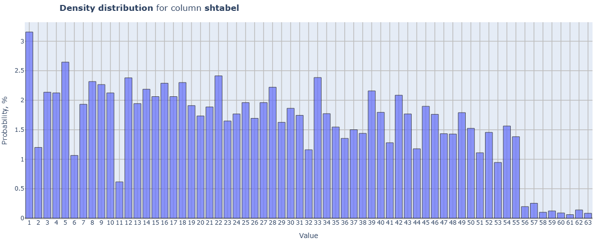
cd_2_3_Density_Distr
- Technical name: cd_2_3_Density_Distr
- Description: Density Distribution. Distribution density for all dataset fields
- Tags: core, data
- Requirements:
typing,pandas - Notes: -
Execution Logic
Loop through all columns of the df:
-
if the data in the column is not numeric, skip it;
-
if the data is categorical (less than or equal to categorial_threshold different values), a histogram is built;
-
if the data is continuous, a line graph of the distribution density is built.
The resulting histograms and graphs are displayed in a common field or in separate fields, depending on the value of split_charts. When displayed in a common field, clicking on the legend allows you to activate the desired element. The scale automatically adjusts to the metric values.
Input Parameters
df: Data object for calculation (dataframe)
categorial_threshold: threshold for the number of unique objects in a categorical column of the dataset (int)
split_charts: flag for separating charts for different columns into different cards (bool)
Results
Chart rendering engine: plotly.js
Output (long): Array of charts
Output (short): None
Output example (picture):
cd_2_4_Density_Distr_features
- Technical name: cd_2_4_Density_Distr_features
- Description: Density Distribution for Selected Columns.
- Tags: core, data
- Requirements:
typing,pandas - Notes: -
Execution Logic
Loop through the selected columns of the dataframe:
-
if the data in the column is not numeric, skip it;
-
if the data is categorical (less than or equal to categorial_threshold distinct values), a histogram is built;
-
if the data is continuous, a line chart of the density distribution is built.
The resulting histograms and charts are displayed in a common field or in separate fields, depending on the value of split_charts.
When displayed in a common field, clicking on the legend allows you to activate the desired element. The scale automatically adjusts to the metric values.
Input Parameters
df: Data object for calculation (dataframe)
categorial_threshold: threshold for the number of unique objects in a categorical column of the dataset (int)
field_columns: List of column names to analyze (multi-column)
split_charts: flag to separate charts for different columns into different cards (bool)
Results
Chart rendering engine: plotly.js
Output (long): Array of charts
Output (short): None
Output example (picture):
cd_2_5_Pivot_table_filtered
- Technical name: cd_2_5_Pivot_table_filtered
- Description: Filtered Pivot Table. A pivot table with values filtered by buttons
- Tags: core, data
- Requirements:
typing,pandas - Notes: -
Execution Logic
Pivot table.
Buttons filter the input dataset for calculation based on values in the filter_column.
For each column in value_columns, all functions from agg_funcs are applied.
ATTENTION: Applying mathematical aggregations will cause an error if there is at least one column with non-numeric data in value_columns.
Input Parameters
df: Dataset for analysis (dataframe)
filter_column: Column whose values are used to filter the data (column)
index_column: Column whose values form the index of the pivot table (column)
value_columns: List of columns for calculating metrics (sum) by groups (multi-column)
agg_funcs: List of aggregation functions used on value_columns. Default=['sum'].
Results
Chart rendering engine: plotly.js
Output (long): Pivot table
Output (short): None
Output example (picture):
cd_2_6_Barchart_filtered
- Technical name: cd_2_6_Barchart_filtered
- Description: Filtered Barchart. Bar chart with values filtered by buttons
- Tags: core, data
- Requirements:
typing,pandas - Notes: -
Execution Logic
Buttons filter the input dataset for calculation based on values in filter_column.
The function agg_funcs is applied to the value_column.
ATTENTION: applying mathematical aggregations will cause an error if value_column contains non-numeric data
Input Parameters
df: Dataset for analysis (dataframe)
filter_column: Column whose values are used to filter the data (column)
index_column: Column for grouping (column)
value_column: Column for calculating metrics (sum) by groups (column)
agg_func: List of aggregation functions used on value_columns. Default=['sum'].
Results
Chart rendering engine: plotly.js
Output (long): Barchart
-
xaxis: values of index_column
-
yaxis: sums of value_column values by groups
Output (short): None
Output example (picture):
cd_2_7_Fill_Pct
- Technical name: cd_2_7_Fill_Pct
- Description: Fill Percent for Features. Barchart with the percentage of non-null values in selected columns
- Tags: core, data
- Requirements:
typing,pandas - Notes: -
Execution Logic
For each of the selected dataframe columns, the ratio of filled (non-Null) fields to the total number of fields is calculated
Input Parameters
df: Data object for calculation (dataframe)
field_columns: Features for calculation (multi-column)
Results
Chart rendering engine: plotly.js
Output (long): Barchart
-
xaxis: names of columns for which the calculation was performed
-
yaxis: percentage of filled values
Output (short): None
Output example (picture):

Distribution Analysis
cd_3_1_Histogram
- Technical name: cd_3_1_Histogram
- Description: Histogram. Histogram for the selected column
- Tags: core, data
- Requirements:
typing,pandas - Notes: -
Execution Logic
Provides a picture of the distribution of values in the selected column
Input Parameters
df: Data object for calculation (dataframe)
field_column: Column for calculation (column)
nbins: Maximum number of bins in the histogram (int value; default 30)
Results
Graph rendering engine: plotly.js
Output (long): Histogram:
-
xaxis: values from the examined column
-
yaxis: frequencies of values
Output (short): None
Output example (picture):

cd_3_2_Target_Variables_Rates
- Technical name: cd_3_2_Target_Variables_Rates
- Description: Target Variables Rates. Proportion of target variable by segments
- Tags: core, data
- Requirements:
typing,pandas - Notes: -
Execution Logic
Data is divided into groups based on the values of cat_field_column.
* Number of groups = number of unique values in cat_field_column
For each group, the following is determined:
-
proportion of observations with target_column==1 among all observations in this group
-
average predict_column for this group
Input Parameters
df: Data object for calculation (dataframe)
target_column: Model target variable (column)
predict_column: Model score (column)
cat_field_column: Column with categorical variable used for grouping (column)
Results
Graph rendering engine: plotly.js
Output (long): Barchart
-
xaxis: groups (cat-field values)
-
yaxis: average values of target and score by groups
Output (short): None
Output example (picture):
cd_3_3_Shapiro_Wilk_Test
- Technical name: cd_3_3_Shapiro_Wilk_Test
- Description: Shapiro-Wilk Test. Test for normality of data distribution
- Tags: core, data, scalar
- Requirements:
typing,pandas,scipy.stats - Notes: nan
Execution Logic
Test for normality of data distribution.
\(H_0\): The given sample comes from a normal distribution.
We calculate the \(P\text{-}value\) using scipy.stats.shapiro, and set up the traffic light indicator based on it.
* If there are missing values in the column, they are excluded from consideration.
Example of setting signal bounds (traffic light):
\(P\text{-}value ≤ 1(\%)\) - red,
\(1(\%) < P\text{-}value ≤ 5(\%)\) - yellow,
\(P\text{-}value > 5(\%)\) - green
Input Parameters
df: Data object for calculation (dataframe)
field_column: Column for calculation (column)
threshold_yellow: yellow boundary of the traffic light
threshold_red: red boundary of the traffic light
Results
Chart rendering engine: not applicable
Output (long): None
Output (short): Number: \(P\text{-}value\)
Output example (picture): not applicable.
cd_3_4_Percentiles
- Technical name: cd_3_4_Percentiles
- Description: Percentiles. Line chart in number-percentile value axes for the selected column
- Tags: core, data
- Requirements:
typing,pandas,numpy,plotly.graph_objects - Notes: -
Execution Logic
*If there are missing values in the column, they are excluded from consideration.
Input Parameters
df: dataset with data for analysis (dataframe)
field_column: name of the column for calculation (column)
Results
Chart rendering engine: plotly.js
Output (long): Line chart
-
xaxis: percentile number (10, 20, ... 90)
-
yaxis: percentile value
Output (short): None
Output example (picture):

Data Dependency Analysis, Feature Selection
cd_4_1_Pearson_Correlations
- Technical name: cd_4_1_Pearson_Correlations
- Description: Pearson Correlations (in %)
- Tags: core, data, scalar
- Requirements:
typing,pandas - Notes: -
Execution Logic
* Only for linear models.
The Pearson correlation coefficient characterizes the existence of a linear relationship between two features (columns of df).
Missing fields are excluded from consideration.
Example of setting signal bounds:
\(max(Corr) > 75\) - red,
\(60 < max(Corr) ≤ 75\) - yellow,
\(max(Corr) ≤ 60\) - green
Input Parameters
df: Data object for calculation (dataframe)
field_columns: Features for calculation (multi-column)
threshold_yellow: yellow threshold for the traffic light
threshold_red: red threshold for the traffic light
Results
Chart rendering engine: plotly.js
Output (long): Heatmap
Pairwise correlation matrix of selected columns
Output (short):
-
Number - maximum value of pairwise correlation for selected columns (in %)
-
Traffic light
Output example (picture):

cd_4_2_Gini_features
- Technical name: cd_4_2_Gini_features
- Description: Gini Index (%) for Features. Gini index (%) broken down by individual factors
- Tags: core, data, risk
- Requirements:
typing,pandas,sklearn.metrics - Notes: -
Execution Logic
In a loop for each field in field_columns:
-
Calculate \(ROC AUC\) using target_column, field
-
\([Gini index] = 2 * [ROC AUC] - 1\)
* If there is a missing value in a feature (field) or target_column, such a row is excluded from consideration. Different rows may be excluded for different features.
The Gini index for a factor serves as an assessment of the factor's ability to separate observations of different classes.
The higher the Gini, the stronger the classes of target_column are separated by the given factor.
This test is used when selecting factors for a model (it's advisable to choose factors with the highest Gini values).
During validation: verification that the factors used in the model are indeed informative.
Example of setting signal bounds:
\(Gini ≤ 5(\%)\) - red,
\(5(\%) < Gini ≤ 15(\%)\) - yellow,
\(Gini > 15(\%)\) - green
Input Parameters
df: dataset with data for analysis (dataframe)
target_column: name of the column with the target (column)
field_columns: array of column names for which we calculate the test (multi-column)
threshold_yellow: yellow threshold for the traffic light
threshold_red: red threshold for the traffic light
Results
Chart rendering engine: plotly.js
Output (long):
Barchart:
-
xaxis: names of columns for which the calculation was performed
-
yaxis: Gini coefficient values (in %)
Traffic light: columns are colored according to the traffic light color for the corresponding feature
Output (short): None
Output example (picture):

cd_4_3_Chi_Square_features
- Technical name: cd_4_3_Chi_Square_features
- Description: Chi Square Test for features Pct. Chi-square test (verification of similarity between 2 categorical distributions) in percentage
- Tags: core, data, scalar
- Requirements:
typing,pandas,scipy.stats - Notes:
Application of this chi-square goodness-of-fit test implementation:
1) Comparison of 2 categorical features
2) Comparison of target distribution and categorical prediction distribution by classes (for example, during model calibration)
Execution Logic
In general: The chi-square test checks the null hypothesis that categorical data have a specified distribution across groups.
In this implementation: \(H_0\): The distributions of the first and second categorical variables are the same
Fulfillment of \(H_0\) is the desired outcome => the higher the \(P\text{-}value\), the better
Example of traffic light setting: \(P\text{-}value ≤ 1(\%)\) - red,
\(1(\%) < P\text{-}value ≤ 5(\%)\) - yellow,
\(P\text{-}value > 5(\%)\) - green
Input Parameters
df: Data object for calculation (dataframe)
cat_feature_1_column: First categorical variable (column)
cat_feature_2_column: Second categorical variable (column)
threshold_yellow: Yellow threshold for traffic light
threshold_red: Red threshold for traffic light
Results
Graph rendering engine: not applicable
Output (long): None
Output (short): \(P\text{-}value\) of the chi-square test,
traffic light
Output example (picture): not applicable.
cd_4_4_VIF (r_3_2_VIF)
- Technical name: cd_4_4_VIF (r_3_2_VIF)
- Description: Variance Inflation Factor. A coefficient that measures inflation of variance. Used to detect multicollinearity.
- Tags: core, data, risk
- Requirements:
typing,pandas,statsmodels.stats.outliers_influence - Notes: -
Execution Logic
For each categorical field in fields_to_test, we calculate statsmodels.stats.outliers_influence.variance_inflation_factor in a loop.
VIF allows us to assess the degree of multicollinearity within the analysis of interdependence of model factors using the least squares method. The index shows how strong the dependence of a factor is on other factors in the model.
(In implementation - the dependence of the selected factor on other factors from fields_to_test).
VIF takes values from 1 to +∞. The higher the value, the stronger the evidence of multicollinearity. A value of 1 indicates orthogonality (independence) of the independent variable from other variables in the model.
* Used for linear models
Example of setting signal bounds:
VIF ≥ 5 - red,
3 ≤ VIF < 5 - yellow,
VIF < 3 - green
Input Parameters
df: dataset with data for analysis (dataframe)
field_columns: array of column names for which we calculate the test (multi-column)
threshold_yellow: yellow threshold for the traffic light
threshold_red: red threshold for the traffic light
Results
Chart rendering engine: plotly.js
Output (long):
Barchart:
-
xaxis: names of columns for which the calculation was performed
-
yaxis: VIF values
Traffic light: columns are colored according to the traffic light color for the corresponding feature
Output (short): None
Output example (picture):

Core package (basic functionality). Regression quality metrics
rvc_1_MAE
- Technical Name: rvc_1_MAE
- Description: Mean Absolute Error (MAE). The average absolute error
- Tags: core, regression, scalar
- Requirements:
typing,pandas,sklearn.metrics - Notes: Apply only to datasets with non-binary target
Execution Logic
Mean Absolute Error
(The average absolute difference between model predictions and target values)
* Rows with missing values in target_column or predict_column are excluded from consideration.
Input Parameters
df: Data object for calculation (dataframe)
target_column: NON-BINARY
model target variable (column)
predict_column: Model prediction (column)
threshold_yellow: yellow traffic light threshold
threshold_red: red traffic light threshold
Results
Graph rendering engine: not applicable
Output (long): None
Output (short):
Numerical value of the mean absolute error,
traffic light
Output example (picture): not applicable.
rvc_2_RMSE
- Technical name: rvc_2_RMSE
- Description: Root Mean Square Error (RMSE). Root mean square error
- Tags: core, regression, scalar
- Requirements:
typing,pandas,sklearn.metrics - Notes: -
Execution Logic
Root of the mean square error
(Square root of the ratio of the sum of squared deviations of model predictions from true values to the number of observations)
* Rows with missing values in target or score are excluded from consideration.
Input Parameters
df: Data object for calculation (dataframe)
target_column: Target variable of the model (column)
predict_column: Model prediction (column)
threshold_yellow: yellow threshold for traffic light
threshold_red: red threshold for traffic light
Results
Graph rendering engine: not applicable
Output (long): None
Output (short):
Numerical value of the root mean square error,
traffic light
Output example (picture): not applicable.
rvc_3_MAPE
- Technical name: rvc_3_MAPE
- Description: Mean Absolute Percentage Error (MAPE). Average absolute error in percentage
- Tags: core, regression, scalar
- Requirements:
typing,pandas,sklearn.metrics - Notes: Apply only to datasets with non-binary target
Execution Logic
The average ratio of the absolute prediction error to the magnitude of the predicted value.
* Rows with missing values in target_column or predict_column are excluded from consideration.
* Rows with target==0 are also excluded from consideration, therefore the metric application is correct only for regression datasets (with non-binary target)
Input Parameters
df: Data object for calculation (dataframe)
target_column: NON-BINARY target variable of the model (column)
predict_column: Model prediction (column)
threshold_yellow: yellow threshold for traffic light
threshold_red: red threshold for traffic light
Results
Graph rendering engine: not applicable
Output (long): None
Output (short):
Numerical MAPE value,
traffic light
Output example (picture): not applicable.
rvc_4_MASE
- Technical name: rvc_4_MASE
- Description: Mean absolute scaled error. Mean absolute scaled error
- Tags: core, regression, scalar
- Requirements:
typing,pandas,sklearn.metrics,numpy - Notes: -
Execution Logic
Mean absolute scaled error
In time series forecasting, MASE provides insight into the effectiveness of a forecasting algorithm relative to a naive forecast. A value greater than one (1) indicates that the algorithm performs poorly compared to a naive forecast.
Input Parameters
df: Data object for calculation (dataframe)
target_column: Target variable of the model (column)
predict_column: Model prediction (column)
threshold_yellow: yellow threshold for traffic light
threshold_red: red threshold for traffic light
Results
Graph rendering engine: not applicable Output (long): None Output (short): Number: value of the mean absolute scaled error
Output example (picture): not applicable.
rvc_5_WAPE
- Technical Name: rvc_5_WAPE
- Description: Weighted Absolute Percentage Error (WAPE). A weighted measure of absolute error in percentages.
- Tags: core, regression, scalar
- Requirements: -
- Notes: Apply only to datasets with non-binary target
Execution Logic
\(\frac{\text{(df[target] - df[predict]).abs().sum()}}{\text{df[target].abs().sum()}}\)
* Rows with missing values in target_column or predict_column are excluded from consideration.
Input Parameters
df: Data object for calculation (dataframe)
target_column: NON-BINARY
target variable of the model (column)
predict_column: Model prediction (column)
threshold_yellow: yellow threshold for traffic light
threshold_red: red threshold for traffic light
Results
Graph rendering engine: plotly.js
Output (long): None
Output (short):
Numerical WAPE value
traffic light
Output example (picture): not applicable.
rvc_6_Weighted_MAPE
- Technical name: rvc_6_Weighted_MAPE
- Description: Weighted MAPE (WMAPE). Weighted Mean Absolute Percentage Error
- Tags: core, regression, scalar
- Requirements:
typing,pandas,sklearn.metrics - Notes: Apply only to datasets with non-binary target
Execution Logic
MAPE values weighted by the weight_column
* Rows with missing values in target_column, predict_column, or weight_column are excluded from consideration.
Input Parameters
df: Data object for calculation (dataframe)
target_column: NON-BINARY
model target variable (column)
predict_column: Model prediction (column)
weight_column: Column used as weight (column)
threshold_yellow: yellow threshold for traffic light
threshold_red: red threshold for traffic light
Results
Graph rendering engine: plotly.js
Output (long): None
Output (short):
Number: value of weighted error,
traffic light
Output example (picture): not applicable.
rvc_7_Average_Bias
- Technical name: rvc_7_Average_Bias
- Description: Average Bias. Average bias for Squared Loss
- Tags: core, regression, scalar
- Requirements:
typing,pandas,numpy - Notes: -
Execution Logic
Definition: Expected value of the difference between the true answer and the answer provided by the algorithm
In implementation:
The average bias is calculated using the formula:
\(mean(abs(target - mean(score)))\)
Decomposition of error into bias and variance: bias_variance_decomp
Input Parameters
df: Data object for calculation (dataframe)
target_column: Target variable of the model (column)
predict_column: Model prediction (column)
threshold_yellow: Yellow threshold for the traffic light
threshold_red: Red threshold for the traffic light
Results
Chart rendering engine: not applicable
Output (long): None
Output (short):
Numerical value of the average bias,
traffic light
Output example (picture): not applicable.
rvc_8_R_Squared_Score
- Technical name: rvc_8_R_Squared_Score
- Description: R2 score. Coefficient of determination
- Tags: core, regression, scalar
- Requirements:
typing,pandas,sklearn.metrics - Notes: Apply only to datasets with non-binary target
Execution Logic
R2 is used to evaluate the performance of a machine learning model based on regression. Its essence is to measure the amount of deviation in predictions explained by the dataset (the difference between samples in the dataset and predictions made by the model).
Input Parameters
df: Data object for calculation (dataframe)
target_column: NON-BINARY target variable of the model (column)
predict_column: Model prediction (column)
weight_column: Column used as weight (column)
threshold_yellow: Yellow threshold for traffic light
threshold_red: Red threshold for traffic light
Results
Graph rendering engine: not applicable
Output (long): None
Output (short):
Numerical value of the coefficient of determination,
traffic light
Output example (picture): not applicable.
rvc_9_Regression_Performance
- Technical name: rvc_9_Regression_Performance
- Description: Regression Performance. Distribution of regression errors and scatter plots in actual-predicted value axes for training and current data
- Tags: core, regression
- Requirements:
typing,pandas - Notes: For large datasets, the resulting graph JSON becomes very large (which affects the display speed in the UI). Consider how to display not all points while correctly representing the nature of the relationships.
Execution Logic
1) Histograms of prediction error distribution (for 2 dataframes);
2) Scatter plots in Actual value - Predicted value coordinates (for 2 dataframes).
Input Parameters
df_reference: dataset with data for the base period, or for the previous period (dataframe)
df_current: dataset with data for the current period (dataframe)
target_column: name of the column with the target (column)
predict_column: name of the column with model predictions (column)
(! column names for target_column and predict_column must match in both df_reference and df_current)
Results
Graph rendering engine: plotly.js
Output (long):
Distribution of regression errors:
-
Histogram of errors on df_reference
-
Histogram of errors on df_current
Scatter plots in actual-predicted value axes:
-
Value scatter plot on df_reference
-
Value scatter plot on df_current
Output (short): None
Output example (picture):


rvc_10_Reg_Error_Analysis
- Technical name: rvc_10_Reg_Error_Analysis
- Description: Regression Error Analysis. Distribution of regression errors and scatter plots in actual-predicted value axes for a single dataset
- Tags: core, regression
- Requirements:
typing,pandas - Notes: -
Execution Logic
1) Histogram of prediction error distribution;
2) Scatter plot in Actual value - Predicted value coordinates.
The metric is similar to item 9, but designed for a single dataset
Input Parameters
df: dataset with data (dataframe)
target_column: name of the target column (column)
predict_column: name of the model prediction column (column)
Results
Graph rendering engine: plotly.js
Output (long):
Distribution of regression errors as a histogram
Scatter plots in actual-predicted value axes
Output (short): None
Output example (picture):


Core package (basic functionality). Classification quality metrics
Binary classification quality assessment
cvc_1_1_F1_score
- Technical name: cvc_1_1_F1_score
- Description: F1 Score. F1 evaluation
- Tags: core, classification, scalar
- Requirements:
typing,pandas,sklearn.metrics - Notes: Implementation can be extended for multi-class classification
Execution Logic
A metric used to measure the accuracy of a binary classification model. Calculated using the formula:
\(F_1 = \frac {2 * (precision * recall)}{(precision + recall)}\)
Input Parameters
df: Data object for calculation (dataframe)
target_column: BINARY target variable of the model (column)
predict_column: BINARY model prediction (column)
threshold_yellow: yellow threshold for traffic light
threshold_red: red threshold for traffic light
Results
Chart rendering engine: not applicable Output (long): None
Output (short): Numerical value of the \(F_1\) score,
traffic light
Output example (picture): not applicable.
cvc_1_2_Precision
- Technical name: cvc_1_2_Precision
- Description: Precision score. Measure of precision
- Tags: core, classification, scalar
- Requirements:
typing,pandas,sklearn.metrics - Notes: Implementation can be extended for multi-class classification
Execution Logic
A metric used to measure the accuracy of a binary classification model.
Calculated as the proportion of true positive predictions among all predicted positive cases.
Input Parameters
df: Data object for calculation (dataframe)
target_column: BINARY
model target variable (column)
predict_column: BINARY model prediction (column)
threshold_yellow: yellow threshold for traffic light
threshold_red: red threshold for traffic light
Results
Graph rendering engine: not applicable
Output (long): None
Output (short):
Numerical precision value,
traffic light
Output example (picture): not applicable.
cvc_1_3_Recall
- Technical name: cvc_1_3_Recall
- Description: Recall score. Measure of completeness
- Tags: core, classification, scalar
- Requirements:
typing,pandas,sklearn.metrics - Notes: Implementation can be extended for multi-class classification
Execution Logic
A metric used to measure the completeness of a binary classification model.
Calculated using the formula:
Calculated as the proportion of true positive predictions among all actual positive cases.
Input Parameters
df: Data object for calculation (dataframe)
target_column: BINARY
model target variable (column)
predict_column: BINARY model prediction (column)
threshold_yellow: yellow threshold for traffic light
threshold_red: red threshold for traffic light
Results
Graph rendering engine: not applicable
Output (long): None
Output (short):
Numerical recall value,
traffic light
Output example (picture): not applicable.
cvc_1_4_Chi_Square_Binary
- Technical name: cvc_1_4_Chi_Square_Binary
- Description: Chi Square Test for binary model. Chi-square test for binary classification model
- Tags: core, classification, scalar
- Requirements:
typing,pandas,scipy.stats - Notes: Implementation can be extended for multi-class classification
Execution Logic
In general: the chi-square test checks the null hypothesis that categorical data have a specified distribution across groups.
In implementation:
\(H_0\): The distributions of target and predict across classes (categories of target) are identical.
If a score (rather than binary prediction) is passed to the predict_column variable, the prediction is calculated by comparing the score with the user-specified class_threshold value.
Fulfillment of \(H_0\) is the desired outcome => the higher the \(P\text{-}value\), the better
Example of setting signal bounds:
\(P\text{-}value ≤ 1(\%)\) - red,
\(1(\%) < P\text{-}value ≤ 5(\%)\) - yellow,
\(P\text{-}value > 5(\%)\) - green
Application of the chi-square goodness-of-fit test:
1) comparing the distribution of mean values of target and predict across groups (e.g., rating scale grades)
2) comparing the distributions of target and predict across classes (e.g., during model calibration)
Input Parameters
df: Data object for calculation (dataframe)
target_column: BINARY
model target variable (column)
predict_column: Model predictions - as probabilities or binary (column)
class_threshold: Class cutoff threshold (float-value, 0.5 by default)
threshold_yellow: yellow traffic light boundary
threshold_red: red traffic light boundary
Results
Graph rendering engine: not applicable
Output (long): None
Output (short):
\(P\text{-}value\) of the chi-square test,
traffic light
Output example (picture): not applicable.
cvc_1_5_Confusion_Matrix
- Technical name: cvc_1_5_Confusion_Matrix
- Description: Confusion Matrix. Error matrix
- Tags: core, classification
- Requirements:
typing,pandas - Notes: Implementation can be extended for multi-class classification
Execution Logic
Used to evaluate model accuracy in classification tasks.
The color display shows the number of:
False Negative (FN), True Positive (TP),
True Negative (TN), False Positive (FP),
algorithm decisions.
If the score variable contains actual scores (not binary predictions), the prediction is calculated by comparing the score with the user-defined class_threshold value.
(For an example of calculating the optimal threshold depending on the sample, see the code for metric r_4_6 Lift_dynamic)
Input Parameters
df: Data object for calculation (dataframe)
target_column: BINARY target variable of the model (column)
predict_column: Model predictions - as probabilities or binary values (column)
class_threshold: Class threshold (float-value, 0.5 by default)
Results
Graph rendering engine: plotly.js
Output (long): Heatmap
Total of 4 fields:
Row 1 - FN, TP
Row 2 - TN, FP
* When hovering with the mouse, the exact number of objects in each category is displayed.
Output (short): None
Output example (picture):

Probability Classification Quality Assessment
cvc_2_1_ROC_AUC
- Technical name: cvc_2_1_ROC_AUC
- Description: ROC Curve plot, ROC-AUC value
- Tags: core, classification, scalar
- Requirements:
typing,pandas,numpy,sklearn.metrics - Notes: -
Execution Logic
ROC curve is used to evaluate the quality of binary classification, as well as probabilistic classification for which threshold values are automatically determined. The X-axis of this graph represents FPR, and the Y-axis represents TPR.
FPR (False Positive Rate) - the proportion of objects incorrectly classified by the algorithm as class 1 among all objects of class 0
TPR (True Positive Rate) - the proportion of correctly classified objects of class 1 among all objects of class 1
AUC = Area Under Curve.
The ROC AUC value (area under the ROC curve) characterizes the quality of the classifier. The higher (closer to 1) the AUC indicator, the better the classifier. A value of 0.5 corresponds to a random classifier - i.e., models with ROC AUC < 0.5 are useless.
Input Parameters
df: Data object for calculation (dataframe)
target_column: Target variable of the model (column)
predict_column: Model prediction (column)
threshold_yellow: yellow threshold for the traffic light
threshold_red: red threshold for the traffic light
Results
Graph rendering engine: plotly.js
Output (long): 2 line graphs:
ROC curve for the model,
ROC curve for a random classifier
-
xaxis: FPR
-
yaxis: TPR
Output (short):
Numerical ROC_AUC value,
traffic light
Output example (picture):

cvc_2_2_Gain_Curve
- Technical name: cvc_2_2_Gain_Curve
- Description: Cumulative Gain Curve plot
- Tags: core, classification
- Requirements:
typing,pandas,numpy - Notes: -
Execution Logic
Classification model evaluation calculated by comparing results obtained with and without the model. The X-axis of this graph represents the Percentage of sample, and the Y-axis represents the Percentage of positive target.
Percentage of sample - the proportion of the processed sample with predictions, sorted from the highest algorithm predictions
Percentage of positive target - the proportion of objects that actually belong to the target class within this sample portion
Input Parameters
df: Data object for calculation (dataframe)
target_column: Target variable of the model (column)
predict_column: Model prediction (column)
Results
Graph rendering engine: plotly.js
Output (long):
Line chart
-
xaxis: Percentage of sample
-
yaxis: Percentage of positive target
Output (short): None
Output example (picture):

cvc_2_3_Lift_Curve_Cumulative
- Technical name: cvc_2_3_Lift_Curve_Cumulative
- Description: Lift Curve graph and Cumulative Lift value for top n% observations
- Tags: core, classification, scalar
- Requirements:
typing,pandas,numpy - Notes: -
Execution Logic
The Lift Curve graph is the ratio of the heights of the Gain curve and the diagonal. The X-axis of this graph represents the Percentage of sample (or PS), and the Y-axis represents Lift.
\(\text{lift} = \frac{\text{cumulative proportion of observations with target_field=1}}{\text{cumulative proportion of observations}}\)
\(\text{lift} = \frac{\text{TPR}}{\text{PS}}\)
Example explanation:
predict_column (sorted in descending order): 0.8; 0.7; 0.6; 0.5; 0.4; 0.2
target_column (corresponding): 1; 1; 0; 1; 0; 0
At the point when we've processed the first three objects in the sample:
-- cumulative proportion of observations with target_field=1:
- total objects with target_field=1 in the entire sample - 3,
- at our point (processed 3 objects) - 2.
So the desired proportion = 2\3
-- cumulative proportion of observations:
-
total observations - 6,
-
we've processed - 3.
So the desired proportion = 3\6
As a result: lift ~ 0.67\0.5
TPR (True Positive Rate) - the proportion of correctly classified objects of class 1 among all "true" objects of class 1 (target_failed = 1). In other words: it's the proportion of target events in the sample relative to all target events in the array.
PS (Percentage of sample) - the proportion of the processed sample with predictions, sorted from the highest algorithm predictions, relative to the total length of the array with predictions.
Interpretation of "top n% observations":
-
n% of objects with the highest algorithm scores are classified as class 1 (i.e., at PS=n/100)
-
Cumulative Lift top n% = max(Lift for PS>=n/100)
General information about Cumulative Lift:
-
Typically, Cumulative Lift is calculated for the top 10% or top 30% of observations.
-
Cumulative Lift decreases as n increases.
-
The higher the Cumulative Lift value, the better the model.
Example of setting signal bounds (traffic light) for n=10:
\(\text{Cumul Lift} ≤ 3\) - red,
\(3< \text{Cumul Lift} ≤ 3.5\) - yellow,
\(\text{Cumul Lift} > 3.5\) - green
Input Parameters
df: Data object for calculation (dataframe)
target_column: Target variable of the model (column)
predict_column: Model prediction (column)
n_perc: Percentage of observations for Cumulative Lift calculation (int value; default 10)
threshold_yellow: yellow boundary of the traffic light
threshold_red: red boundary of the traffic light
Results
Graph rendering engine: plotly.js
Output (long):
Line graph:
-
xaxis: PS
-
yaxis: lift = TPR/PS
Vertical line:
x = n_perc/100
Output (short): Cumulative Lift value for top n% observations,
traffic light
Output example (picture):

cvc_2_4_CAP_Curve_accuracy_rate
- Technical name: cvc_2_4_CAP_Curve_accuracy_rate
- Description: CAP Curve and AR score. Cumulative Accuracy Profile graph and accuracy rate value (%)
- Tags: core, classification, scalar
- Requirements:
typing,pandas,numpy,sklearn.metrics - Notes: -
Execution Logic
CAP curve - is an analog of the Gain curve
An evaluation of classification model effectiveness, calculated by comparing results obtained with and without the model.
In implementation: instead of proportions, the number of objects from the sample is displayed.
Explanation using a model calculating probability of default (PD):
The CAP curve is constructed with the proportion of observations (x-axis) and the proportion of defaults by observations (y-axis).
*Observations are ordered by decreasing PD (probability of default) of counterparties before plotting.
A perfect model quickly reaches 1, i.e., passes through all defaults.
A random model is equidistant from both axes.
The target model should perform more accurately than "coin flipping," so its CAP curve should pass higher than the random model.
Accuracy rate calculation:
Let aP be the area between the CAP curves of the perfect and random models,
and aR be the area between the CAP curves of the model under consideration and the random model.
Then the accuracy rate index is defined as \(\frac{\text{aR}}{\text{aP}}*100\%\).
Properties of accuracy rate:
-
The maximum value of this ratio is 1, achieved if the model is a perfect model.
-
Positive non-zero values of the index indicate that the model performs better than "coin flipping."
Input Parameters
df: Data object for calculation (dataframe)
target_column: Target variable of the model (column)
predict_column: Model prediction (column)
threshold_yellow: yellow threshold for traffic light
threshold_red: red threshold for traffic light
Results
Graph rendering engine: plotly.js
Output (long): Line graph
- xaxis:
Cumulative number of observations (sorted by decreasing predict_column) (*similar to PR)
- yaxis:
Cumulative number of class 1 objects (target_field=1 in the df array, rows sorted by decreasing predict_column).
(*similar to TPR)
Output (short):
Number: accuracy rate value based on CAP for the model (in %)
traffic light
Output example (picture):
cvc_2_5_PR_Curve_PRC_AUC
- Technical name: cvc_2_5_PR_Curve_PRC_AUC
- Description: PR Curve and PRC-AUC. Precision-Recall Curve graph and PRC-AUC value
- Tags: core, classification, scalar
- Requirements:
typing,pandas,numpy,sklearn.metrics - Notes: -
Execution Logic
PR Curve is a graph showing the relationship between recall and precision with different thresholds. The X-axis of this graph represents Recall, and the Y-axis represents Precision. Each point on this curve corresponds to a classifier with a specific threshold value.
* In the case of an ideal classifier, i.e., if there exists a threshold where both precision and recall equal 100%, the curve will pass through the point (1,1). Thus, the closer the curve passes to this point, the better the evaluation.
The area under this curve is called PRC-AUC, or the area under the PR curve.
\(\text{Precision} = \frac{TP}{TP + FP}\), the proportion of correctly classified objects of class 1 among all objects classified by the algorithm as class 1.
\(\text{Recall} = \frac{TP}{TP + FN}\), the proportion of correctly classified objects of class 1 among all objects of class 1.
Threshold is the value against which it is determined to which class a data object will be assigned.
Input Parameters
df: Data object for calculation (dataframe)
target_column: Target variable of the model (column)
predict_column: Model prediction (column)
threshold_yellow: yellow threshold for the traffic light
threshold_red: red threshold for the traffic light
Results
Graph rendering engine: plotly.js
Output (long): Line graph:
1) PR Curve:
-
xaxis: recall
-
yaxis: precision
2) Vertical line: x = optimal threshold for predict_column values
Output (short):
Numeric value PRC-AUC,
traffic light
Output example (picture):

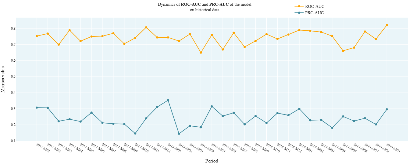
cvc_2_6_AUCs_Dynamic
- Technical name: cvc_2_6_AUCs_Dynamic
- Description: AUCs Dynamic. Dynamics of ROC AUC and PRC AUC model metrics on historical data
- Tags: core, classification
- Requirements:
typing,pandas,sklearn.metrics - Notes: -
Execution Logic
Observations from df are divided into groups based on the values in the date column (report_dt).
All observations for a period (months, quarter, or year) are grouped together.
ROC AUC and PRC AUC are calculated for the observations in each group.
Input Parameters
df: dataset with research data (dataframe)
target_column: name of the target column (column)
predict_column: name of the score column (column)
report_dt_column: name of the date column (column)
period: data granularity: dropdown: - one of the string values: 'month', 'quarter', 'year'; - default - 'quarter'
Results
Chart rendering engine: plotly.js
Output (long): Array of charts: - xaxis: period - yaxis: values of ROC AUC and PRC AUC calculated on observations for the corresponding period.
Output (short): None
Output example (picture):
cvc_2_7_Gini_model
- Technical name: cvc_2_7_Gini_model
- Description: Gini Index (%) for Model. Gini Index (%) for the model
- Tags: core, classification, risk, scalar
- Requirements:
typing,pandas,sklearn.metrics - Notes: -
Execution Logic
-
Calculate ROC AUC using target_field, score_field
-
[Gini index] = 2 * [ROC AUC] - 1
The Gini index allows evaluating the predictive capability of a model relative to a random classifier.
The higher the Gini index, the better the model is at separating classes.
Gini from 0 to 1 (up to 100%) - the model is better than a random classifier
Gini less than 0 - the model is worse than a random classifier
Example of setting signal bounds:
\(\text{Gini} ≤ 40(\%)\) - red,
\(40(\%) < \text{Gini} ≤ 60(\%)\) - yellow,
\(\text{Gini} > 60(\%)\) - green
Input Parameters
df: dataset with research data (dataframe)
target_column: name of the target column (column)
predict_column: name of the score column (column)
threshold_yellow: yellow traffic light boundary
threshold_red: red traffic light boundary
Results
Graph rendering engine: not applicable
Output (long): None
Output (short):
Number: Gini index value (in %),
traffic light
Output example (picture): not applicable.
cvc_2_8_KS_Test_Predicts
- Technical name: cvc_2_8_KS_Test_Predicts
- Description: Kolmogorov-Smirnov Test. Compares score distributions for "good"/"bad" clients
- Tags: core, classification, scalar
- Requirements:
typing,pandas,numpy,scipy.stats - Notes: -
Execution Logic
Compares score distributions for "good" (target==0) and "bad" (target==1) clients.
H_0: distributions are identical.
It is desirable to have statistically significant differences between groups (this means the model separates classes well) => the smaller the \(P\text{-}value\), the better.
Implementation: Two-sample Kolmogorov-Smirnov test ks_2samp from scipy.stats
(testing the hypothesis that values from two independent samples belong to the same distribution law)
Input Parameters
df: dataset with research data (dataframe)
target_column: name of the target column (column)
predict_column: name of the score column (column)
threshold_yellow: yellow traffic light threshold
threshold_red: red traffic light threshold
Results
Graph rendering engine: plotly.js
Output (long): Array of graphs
Output (short):
Numerical values:
1) K-S statistics, % (scalar)
2) \(P\text{-}value\) of K-S test, % (on the graph)
traffic light on K-S statistics, %
Output example (picture):

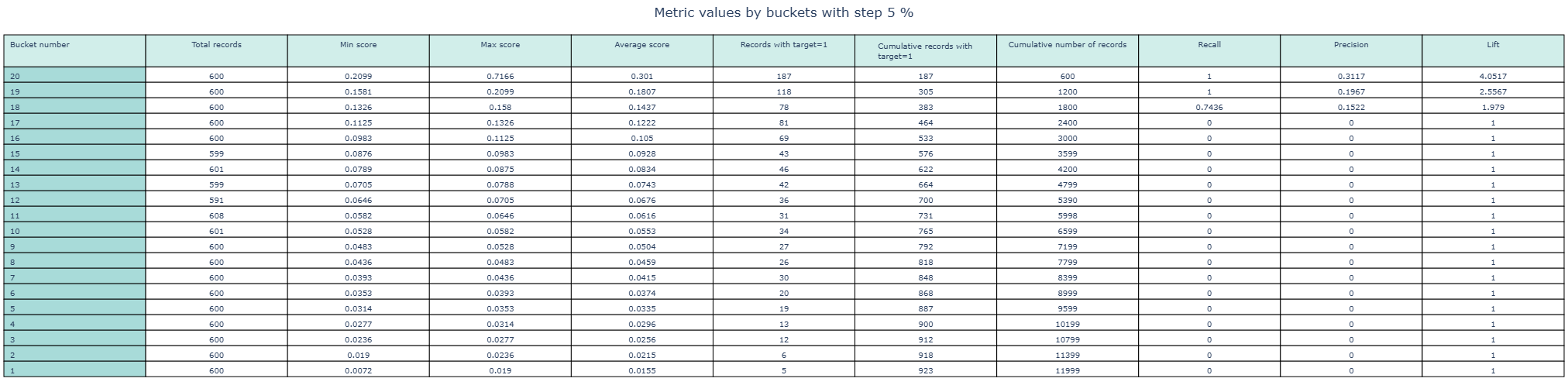
cvc_2_9_Barometers_by_bins
- Technical name: cvc_2_9_Barometers_by_bins
- Description: Table of barometers by bins. Table of indicators by buckets. Indicators by buckets: accuracy, recall, lift, max, min and average score, etc.
- Tags: nan
- Requirements:
typing,pandas,numpy,sklearn.metrics - Notes: -
Execution Logic
The dataframe is divided into a specified number (nbins) of buckets by score quantiles.
For each bucket (bin), the following are displayed:
- bin number
- number of records in the bin
- min score in the bin
- max score in the bin
- average score in the bin
- number of records with target==1 in the bin
- cumsum (target) across the aggregated table
- cumsum (number of records in the bin) across the aggregated table
- recall
- precision
- lift
Input Parameters
df: dataset with data for analysis (dataframe)
target_column: name of the target column (column)
predict_column: name of the score column (column)
nbins: number of buckets (int value; default 20)
Results
Chart rendering engine: plotly.js
Output (long):
Table 11 columns (corresponding to the number of calculated indicators), number of rows = number of buckets
Output (short): no
Output example (picture):
Risk validation package
Data Quality
r_1_1_PSI_field
- Technical name: r_1_1_PSI_field
- Description: PSI Features. Population stability index (PSI) for features
- Tags: risk
- Requirements:
typing,pandas,numpy,plotly.graph_objects
Note:
-
Execution Logic
PSI is a measure of the distance between two distributions.
For each of the selected factors, the degree of difference in the distributions of this factor in the training and testing samples is determined.
In a loop for each field from fields_to_test:
- If the feature is categorical, proceed to step 2. If continuous, automatic binning should be performed (10-20 buckets).
- For each category, separately calculate the percentage of observations belonging to this category in train and test.
- temp_i = (%test - %train) * ln(%test / %train)
- PSI = sum of temp_i across all categories
Possible range of PSI values: (0; +inf).
The lower the PSI, the less the feature distributions differ between train and test => The lower the PSI for a factor, the better (more stable) that factor is.
Example of signal bounds: PSI < 0.1 - green, 0.1 < PSI < 0.25 - yellow, PSI > 0.25 - red
Input Parameters
df_train: dataset with training data (dataframe)
df_test: dataset with test data (dataframe)
field_columns: array of attribute names for which PSI is calculated (multi-column)
threshold_yellow: yellow traffic light boundary
threshold_red: red traffic light boundary (! column names from field_columns must match in df_train and df_test)
Results
Graph rendering engine: plotly.js
Output (long):
Barchart xaxis: Columns correspond to features for which calculation was performed yaxis: Bar height - PSI value for the feature
traffic light: bars are colored according to the traffic light color for the corresponding feature
Output (short):
None
Output example (picture):

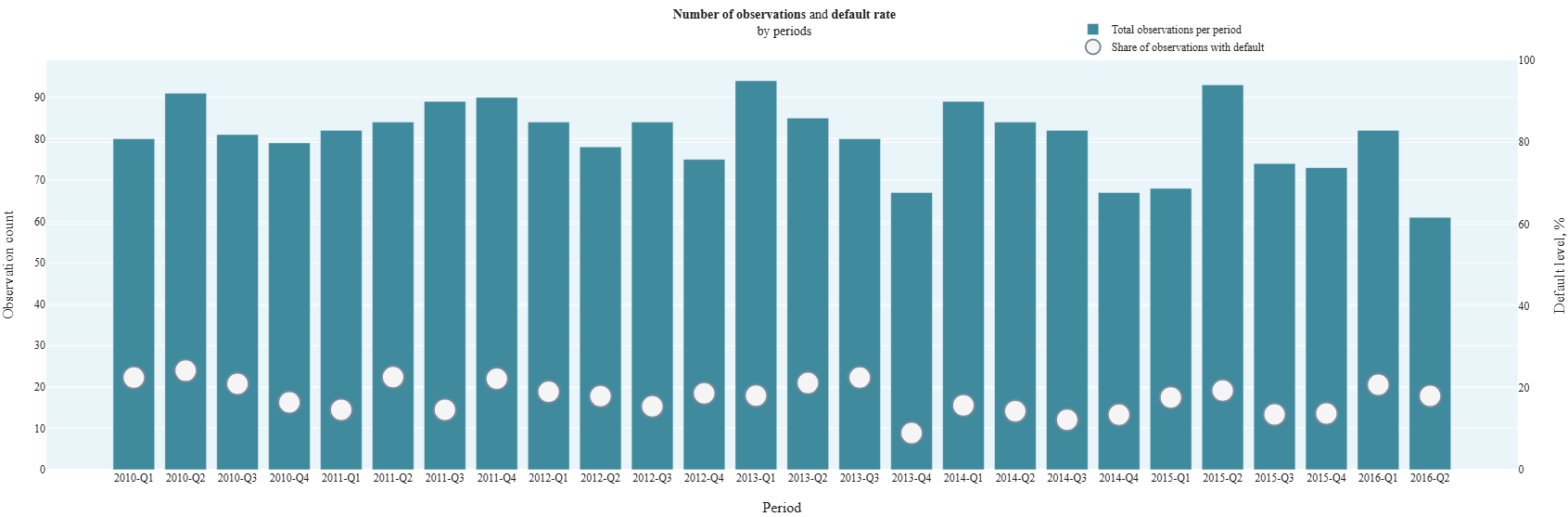
r_1_2_Default_rate_dynamic
- Technical name: r_1_2_Default_rate_dynamic
- Description: Default Rate Dynamic. Default level on historical data:
- percentage (%) of observations with default by periods,
- total number of observations by periods.
- Tags: risk
- Requirements:
typing,pandas,plotly.graph_objects
Note:
-
Execution Logic
Group data with period granularity.
For each group (period), display on a combined chart:
- number of observations
- % of observations with default = (number of observations with [target=1] for the period) / (number of observations for the period) * 100%
The test is typically used for initial model validation. (For example, to assess the class ratio in samples, search for periodicity over time, filter out data that is too old and irrelevant)
Input Parameters
df: dataset with research data (dataframe)
target_column: name of the target column (column)
report_dt_column: name of the date column (column)
period: data granularity
(dropdown - one of the string values: 'month', 'quarter', 'year';
default - 'quarter')
Results
Chart rendering engine: plotly.js
Output (long):
Barchart
xaxis: Columns correspond to periods
yaxis:
- Bar height (left scale) - number of observations in the dataset related to the selected period
- Point (right scale) - percentage (%) of observations with default in the selected period
Output (short):
None
Output example (picture):
Ranking Ability
cvc_2_7_Gini_model (r_2_1_Gini_model)
- Technical name: cvc_2_7_Gini_model (r_2_1_Gini_model)
- Description: Gini Index (%) for Model. Gini Index (%) for the model
- Tags: -
- Requirements: -
Note:
-
Execution Logic
See section "Core package/Classification Quality Metrics", item 2.7
Input Parameters
-
Results
Chart rendering engine: not applicable
Output (long): None
Output (short):
None
Output example (picture): not applicable.
cd_4_2_Gini_features (r_2_2_Gini_features)
- Technical name: cd_4_2_Gini_features (r_2_2_Gini_features)
- Description: Gini Index (%) for Features. Gini Index (%) broken down by individual factors
- Tags: -
- Requirements: -
Note:
-
Execution Logic
See section "Core package/Data Analysis", point 4.2
Input Parameters
-
Results
Graph rendering engine: not applicable
Output (long): None
Output (short):
None
Output example (picture): not applicable.
r_2_3_Gini_bootstrap_model
- Technical name: r_2_3_Gini_bootstrap_model
- Description: Bootstrapped Gini Index (%) for Model. Gini Index (%) for the model on bootstrap subsamples. Interval version of the point Gini estimate (see 2.1). Used when there is class imbalance in the sample.
- Tags: risk, scalar
- Requirements:
typing,pandas,sklearn.metrics,joblib,numpy
Note:
-
Execution Logic
- Collect a sample of bootstrap_n Gini values calculated on bootstrap subsamples
- Select the percentile 'perc' from the resulting sample
For an imbalanced sample, this helps avoid bias in the point estimate. By default, the 2.5 percentile of the Gini distribution is used.
The higher the Bootstrapped Gini value, the better the predictive ability of the model.
Example of setting signal bounds: Bootstrapped Gini ≤ 30(%) - red, 30(%) < Bootstrapped Gini ≤ 45(%) - yellow, Bootstrapped Gini > 45(%) - green
Input Parameters
df: dataset with data for analysis (dataframe)
target_column: name of the target column (column)
predict_column: name of the score column (column)
bootstrap_n: number of bootstrap subsamples (int value; default 1000)
perc: percentile used for the final assessment (float value; default 2.5)
threshold_yellow: yellow threshold for the traffic light
threshold_red: red threshold for the traffic light
Results
Graph rendering engine: not applicable
Output (long): None
Output (short):
Number: Gini index value (in %) (2.5 percentile of the Gini distribution on bootstrapped subsamples from the original df),
traffic light
Output example (picture): not applicable.
r_2_4_Gini_bootstrap_field
- Technical Name: r_2_4_Gini_bootstrap_field
- Description: Bootstrapped Gini Index (%) for Features. Gini Index (%) for individual features on bootstrap subsamples. Interval version of the Gini estimate for features (see 2.2). Used when there is class imbalance in the dataset.
- Tags: risk
- Requirements:
typing,pandas,sklearn.metrics,joblib,numpy
Note:
-
Execution Logic
In a loop for each field in fields:
- Collect a sample of bootstrap_n Gini values calculated on bootstrap subsamples
- Select the percentile perc from the resulting sample
For imbalanced datasets, this helps avoid bias in point estimates. By default, the 2.5 percentile of the Gini distribution is used.
If there is a missing value in a feature (field) or target, such a row is excluded from consideration. Different rows may be excluded for different features. The higher the Bootstrapped Gini value for a feature, the better the ranking ability of that feature.
Example of signal bounds: Bootstrapped Gini ≤ 3(%) - red, 3(%) < Bootstrapped Gini ≤ 5(%) - yellow, Bootstrapped Gini > 5(%) - green
Input Parameters
df: dataset with data for analysis (dataframe)
target_column: name of the target column (column)
field_columns: array of column names for which the test is calculated (multi-column)
bootstrap_n: number of bootstrap subsamples (int value; default 1000)
perc: percentile used for the final assessment (float value; default 2.5)
threshold_yellow: yellow threshold for the traffic light
threshold_red: red threshold for the traffic light
Results
Chart rendering engine: plotly.js
Output (long):
Barchart: xaxis: names of columns for which the calculation was performed yaxis: Gini coefficient values (in %) (2.5 percentile of the Gini distribution for the feature on bootstrapped subsamples)
traffic light: columns are colored according to the traffic light color for the corresponding feature
Output (short):
None
Output example (picture):

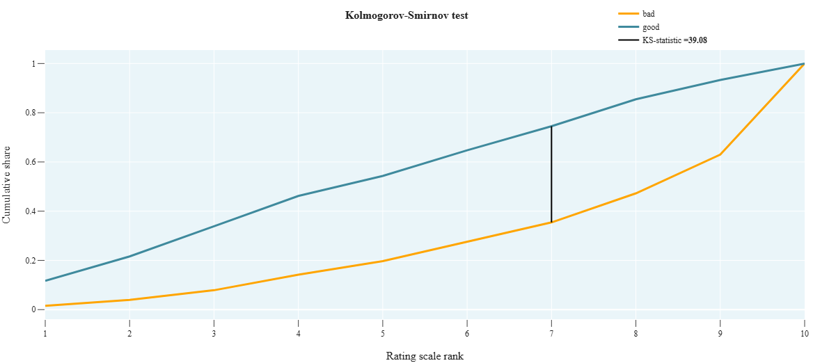
r_2_5_KS_on_scale
- Technical name: r_2_5_KS_on_scale
- Description: KS-test on scale. Kolmogorov-Smirnov test. Checks how different two distributions are and shows how well the model score separates good clients from bad ones across the rating scale.
- Tags: risk, scalar
- Requirements:
typing,pandas,numpy
Note:
-
Execution Logic
- We collect 2 cumulative distributions:
- Good - proportion of clients with [target_field = 0] grouped by scale_field
- Bad - proportion of clients with [target_field = 1] grouped by scale_field
- Calculate the statistic value max(|Good-Bad|) across all scale grades. The larger, the better.
Alternative to cvc_2_8_KS_Test_Predicts using the scale. Usually, rating scale grades are assigned based on the model score.
Scale formation: based on the model prediction (score), each observation is assigned a rating scale grade => we get a categorical variable
Graph interpretation: for a good model, the bad and good curves should be distant from each other.
H_0 of the K-S test: samples are taken from the same distribution.
We need bad and good to differ as much as possible =>
The higher the K-S statistic value, the better.
Example of setting signal bounds: KS ≤ 30(%) - red,
30(%) < KS ≤ 40(%) - yellow,
KS > 40(%) - green
Input Parameters
df: dataset with research data (dataframe)
target_column: name of the target column (column)
scale_column: name of the column with assigned rating scale grade (column)
threshold_yellow: yellow traffic light boundary
threshold_red: red traffic light boundary
Results
Graph rendering engine: plotly.js
Output (long):
Array of graphs:
- xaxis: rating scale grades
- yaxis: cumulative probability,
- K-S statistic value (in %) - in the legend
Output (short):
Number: K-S statistic value (in %)
traffic light
Output example (picture):
r_2_6_IV_model
- Technical name: r_2_6_IV_model
- Description: Information Value for the model. Shows the degree of difference in predict distributions for good and bad clients
- Tags: risk, scalar
- Requirements:
typing,pandas,numpy,scipy.stats.stats,sklearn, +, WOE transformation, created by a separate class in the same metric file
Note:
-
Execution Logic
- Perform automatic binning of score_field (10-20 buckets).
- For each category, calculate:
- %good - percentage of observations with [target=0]
- %bad - percentage of observations with [target=1]
- temp_i = (%good - %bad) * ln(%good / %bad)
- IV = sum of temp_i across all categories
The formula is similar to PSI, but while PSI compares the distribution of a variable across different time periods, IV compares the score distribution for good and bad clients (we divide into "good" and "bad" based on the target value)
The more these distributions differ, the better => the higher the IV, the better.
Example of setting signal bounds: IV ≤ 10(%) - red,
10(%) < IV ≤ 30(%) - yellow,
IV > 30(%) - green
Input Parameters
df: dataset with research data (dataframe)
target_column: name of the target column (column)
predict_column: name of the score column (column)
threshold_yellow: yellow traffic light boundary
threshold_red: red traffic light boundary
Results
Graph rendering engine: not applicable
Output (long): None
Output (short):
Number: Information Value for the model (in %),
traffic light
Output example (picture): not applicable.
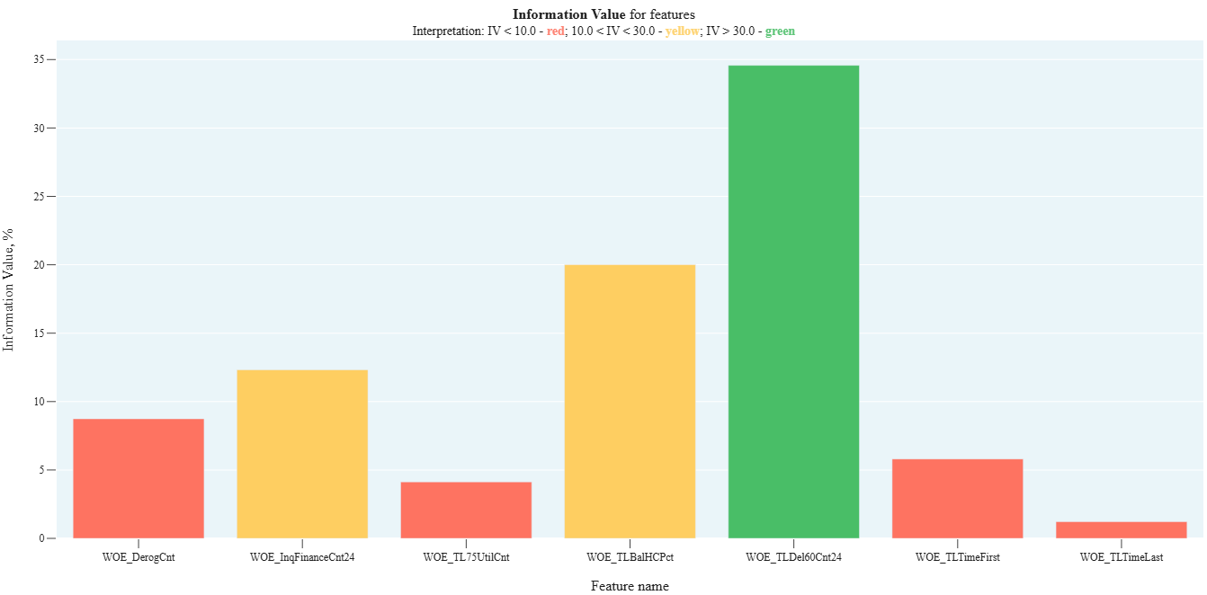
r_2_7_IV_field
- Technical Name: r_2_7_IV_field
- Description: Information Value by individual factors. Shows the degree of difference in factor distributions between good and bad clients
- Tags: risk
- Requirements:
typing,pandas,numpy,scipy.stats.stats,sklearn, +, WOE transformation created by a separate class in the same metrics file
Note:
-
Execution Logic
For each field in fields:
- If the field is categorical, proceed to step 2, otherwise perform automatic binning (10-20 buckets).
- For each category, calculate:
- %good - percentage of observations with [target=0]
- %bad - percentage of observations with [target=1]
- temp_i = (%good - %bad) * ln(%good / %bad)
- IV = sum of temp_i across all categories
The higher the IV for a feature, the better (the more informative the feature is).
The test is used for model feature selection. (See article about WOE and IV)
Example of signal bounds: IV ≤ 10(%) - red, 10(%) < IV ≤ 30(%) - yellow, IV > 30(%) - green
Input Parameters
df: dataset with research data (dataframe)
target_column: name of the target column (column)
field_columns: array of column names for which the test is calculated (multi-column)
threshold_yellow: yellow traffic light boundary
threshold_red: red traffic light boundary
Results
Graph rendering engine: plotly.js
Output (long):
Barchart:
- xaxis: names of columns for which the calculation was performed
- yaxis: Information Value values (in %)
- traffic light: columns are colored according to the traffic light color for the corresponding feature
Output (short):
None
Output example (picture):
r_2_8_HL_test
- Technical name: r_2_8_HL_test
- Description: Hosmer–Lemeshow Test. Chi-square test that checks the similarity of distributions between the mean actual and mean predicted default rates across buckets
- Tags: risk, scalar
- Requirements:
typing,pandas,scipy.stats
Note:
-
Execution Logic
- For the i-th grade of the scale, the following parameters are calculated:
- \(N_i\) - number of observations in the bucket
- \(PD_i\) - average value of score_field for the bucket (predicted default rate)
- \(DR_i\) - average value of target_field for the bucket (actual default rate)
- The Hosmer-Lemeshow statistic is calculated using the formula

- \(P\text{-}value\) is determined by the chi-square distribution (scipy.stats.chi2)
H_0: distributions across groups are the same.
We aim for the distributions across buckets for target and score to be as similar as possible => The higher the \(P\text{-}value\), the better
Example of signal bounds setting:
\(P\text{-}value ≤ 1(\%)\) - red,
\(1(\%) < P\text{-}value ≤ 5(\%)\) - yellow,
\(P\text{-}value > 5(\%)\) - green
Also used for model calibration.
Input Parameters
df: dataset with research data (dataframe)
target_column: name of the target column (column)
predict_column: name of the score column (column)
scale_column: name of the column with assigned rating scale grade (column)
threshold_yellow: yellow threshold for the traffic light
threshold_red: red threshold for the traffic light
Results
Graph rendering engine: not applicable
Output (long): None
Output (short):
Number: \(P\text{-}value\) of the Hosmer-Lemeshow test (in %),
traffic light
Output example (picture): not applicable.
r_2_9_MW_test
- Technical name: r_2_9_MW_test
- Description: Mann-Whitney Test (left-sided). Checking the similarity of score and target distributions by buckets (rank-based method)
- Tags: risk, scalar
- requirements:
typing,pandas,scipy.stats
Note:
-
Execution Logic
- Split the score into nbins buckets by quantiles --> resulting in a categorical variable with nbins values.
- Group observations by the new categorical variable. In each group, calculate mean(score) and mean(target) --> resulting in two samples: average scores by buckets and average targets by buckets.
- Using the non-parametric Mann-Whitney test (scipy.stats.mannwhitneyu), test the hypothesis that these samples belong to the same general population.
- Output the \(P\text{-}value\).
We aim for the distributions by buckets for score and target to be as similar as possible => The higher the \(P\text{-}value\), the better.
Used for: model calibration, stability checking.
Example of signal bounds setting:
\(P\text{-}value ≤ 1(\%)\) - red,
\(1(\%) < P\text{-}value ≤ 5(\%)\) - yellow,
\(P\text{-}value > 5(\%)\) - green
Input Parameters
df: dataset with research data (dataframe)
target_column: name of the target column (column)
predict_column: name of the score column (column)
nbins: number of buckets into which the score is divided by quantiles
(int value; default 50)
threshold_yellow: yellow traffic light boundary
threshold_red: red traffic light boundary
Results
Graph rendering engine: not applicable
Output (long): None
Output (short):
Number: \(P\text{-}value\) of the Mann-Whitney test (in %),
traffic light
Output example (picture): not applicable.
Specification (only for linear models)
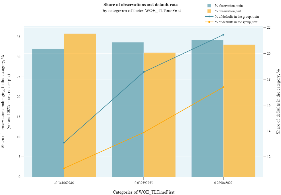
r_3_1_Monotony_field
- Technical name: r_3_1_Monotony_field
- Description: Monotony Field. Default rate and number of observations by factor categories on train/test
- Tags: risk
- requirements:
typing,pandas
Note:
-
Execution Logic
We divide observations into groups according to the values of the categorical variable field. Number of groups = number of unique values in field.
For categorical field, we draw a combined chart:
- Barchart: % of observations in each field category on train and test = (observations in selected category) / (total observations in the sample) * 100
- Line: % of defaults in each field category on train and test = (observations with target==1 in selected category) / (total observations in selected category) * 100
The test is applied if binning or WOE (Weight of Evidence) were used in the model. For ordered WOE, the default rate should strictly increase
Input Parameters
df_train: dataset with training data (dataframe)
df_test: dataset with test data (dataframe)
target_column: name of the column with the target (column)
cat_field_column: name of the column with the categorical variable by which we divide observations into groups (column) (! column names for target_column and cat_field_column must match in df_train and df_test)
Results
Chart rendering engine: plotly.js
Output (long):
Array of charts Barchart: xaxis: each pair of columns corresponds to one value of the categorical variable field on train/test yaxis (left scale): column height = proportion of all observations belonging to the selected category Lines: yaxis (right scale): proportion of defaults in the selected category
Output (short):
None
Output example (picture):
cd_4_4_VIF (r_3_2_VIF)
- Technical name: cd_4_4_VIF (r_3_2_VIF)
- Description: Variance Inflation Factor (used for detecting multicollinearity)
- Tags: -
- Requirements: -
Note:
-
Execution Logic
See section "Core package/Data Analysis", item 4.4
Input Parameters
-
Results
Graph rendering engine: not applicable
Output (long): None
Output (short):
None
Output example (picture): not applicable.
r_3_3_Spearman_Correlation
- Technical name: r_3_3_Spearman_Correlation
- Description: Spearman Correlations. Matrix of pairwise Spearman rank correlations and maximum correlation value (%)
- Tags: risk, scalar
- Requirements:
typing,pandas
Note:
-
Execution Logic
We draw a heatmap with a matrix of pairwise correlations of all features from fields_to_test. Missing fields are excluded from consideration.
Spearman correlation is a nonparametric measure of statistical dependence between two variables. It assesses how well the relationship between variables can be described using a monotonic function.
In the absence of repeated values, a Spearman coefficient of +1 or -1 indicates that one variable is a strictly monotonic function of the other (the relationship is not necessarily linear).
The Spearman correlation coefficient is less sensitive to outliers than the Pearson correlation coefficient.
Example of setting signal bounds:
max(Corr) ≥ 50 - red,
40 ≤ max(Corr) < 50 - yellow,
max(Corr) < 40 - green
Input Parameters
df: dataset with data for analysis (dataframe)
field_columns: array of column names to calculate the test on
(multi-column)
threshold_yellow: yellow threshold for the traffic light
threshold_red: red threshold for the traffic light
Results
Graph rendering engine: plotly.js
Output (long):
Heatmap: Matrix of pairwise correlations of selected columns
Output (short):
Number: maximum value of pairwise correlation for selected columns, in %
traffic light
Output example (picture):

Stability
r_4_1_Gini_diff_model
- Technical name: r_4_1_Gini_diff_model
- Description: Absolute value of the Gini Index change (in %) between train/test. Shows how much the predictive ability of the model differs across different samples
- Tags: risk, scalar
- Requirements:
typing,pandas,sklearn.metrics
Note:
-
Execution Logic
abs([Gini index_test] - [Gini index_train])
The smaller the Gini difference value, the better.
If Gini on the test is significantly less than on the train, overfitting has occurred.
Example of setting signal bounds:
|Δ Gini| < 5% - green,
5% ≤ |Δ Gini| < 10% - yellow,
|Δ Gini| ≥ 10% - red
Input Parameters
df_train: dataset with training data (dataframe)
df_test: dataset with test data (dataframe)
target_column: name of the column with the target (column)
predict_column: name of the column with the score (column)
threshold_yellow: yellow threshold for the traffic light
threshold_red: red threshold for the traffic light (! column names for target_column and predict_column must match in df_train and df_test)
Results
Chart rendering engine: plotly.js
Output (long):
Barchart: 2 columns - corresponding to train and test samples. Column height - Gini value for the model on the specified sample.
Output (short):
Number: difference in Gini between train and test in % (displayed as part of the header)
Output example (picture):
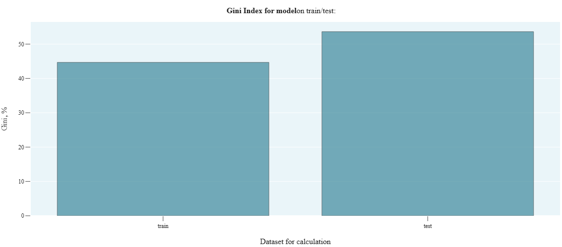
r_4_2_Gini_reltv_diff_model
- Technical name: r_4_2_Gini_reltv_diff_model
- Description: Relative change in the model's Gini index (in %) between train and test sets. Shows how much the predictive ability of the model improved/deteriorated on the test set relative to its predictive ability on the train set.
- Tags: risk, scalar
- Requirements:
typing,pandas,sklearn.metrics
Note:
-
Execution Logic
([Gini index_test] - [Gini index_train]) / [Gini index_train]
The smaller the absolute value of the indicator, the better.
Example of setting signal bounds:
|Δ Gini| < 10% - green,
10% ≤ |Δ Gini| < 20% - yellow,
|Δ Gini| ≥ 20% - red
Input Parameters
df_train: dataset with training data (dataframe)
df_test: dataset with test data (dataframe)
target_column: name of the column with the target (column)
predict_column: name of the column with the score (column)
threshold_yellow: yellow threshold for the traffic light
threshold_red: red threshold for the traffic light (! column names for target_column and predict_column must match in df_train and df_test)
Results
Chart rendering engine: not applicable
Output (long): None
Output (short):
Number: relative change in model's Gini, in %,
traffic light
Output example (picture): not applicable.
r_4_3_Gini_diff_features
- Technical name: r_4_3_Gini_diff_features
- Description: Relative change in Gini index on train/test across individual factors. Shows how much the informativeness of each factor improved/deteriorated on the test set relative to the informativeness of this factor on the training set.
- Tags: risk
- Requirements:
typing,pandas,sklearn.metrics
Note:
-
Execution Logic
In a loop for each categorical field from fields, we calculate: abs([Gini index_test] - [Gini index_train])
If there is a missing value in a feature (field) or target, such a row is excluded from consideration.
Different rows are excluded from consideration for different features.
The smaller the absolute values of the indicators, the better.
Example of setting signal bounds for the relative change in the Gini index for factors between two adjacent data slices:
\Δ Gini\ < 10% - green,
10% ≤ \Δ Gini\ < 15% - yellow,
\Δ Gini\ ≥ 15% - red
Input Parameters
df_train: dataset with training data (dataframe)
df_test: dataset with test data (dataframe)
target_column: name of the target column (column)
field_columns: array of column names for which we calculate the test
(multi-column)
threshold_yellow: yellow threshold for the traffic light
threshold_red: red threshold for the traffic light (! column names with target_column and field_columns must match in df_train and df_test)
Results
Chart rendering engine: plotly.js
Output (long):
Barchart: Columns correspond to features Column height - difference in Gini for the corresponding feature on train and test.
Traffic light: columns are colored according to the traffic light color for the corresponding feature
Output (short):
None
Output example (picture):
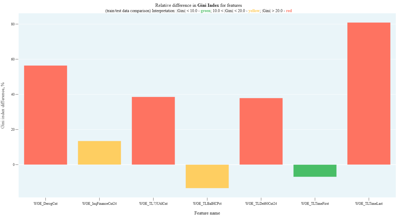
r_4_4_Gini_dynamic_model
- Technical name: r_4_4_Gini_dynamic_model
- Description: Dynamics of the model's Gini index. Bar-chart with Gini values for the model across different time periods
- Tags: risk, scalar
- Requirements:
typing,pandas,sklearn.metrics,numpy
Note:
-
Execution Logic
Observations from df are divided into groups based on the values in the date column (report_dt). All observations for a period (months, quarter, or year) fall into one group.
The Gini index for the model is calculated for observations in each group.
The higher the Gini, the better the model. Gini less than 0 means that the model results are worse than random guessing. In dynamics: the more stable the Gini, the better.
Example of setting signal bounds for absolute change in the model's Gini index between two adjacent data slices: \Δ Gini\ < 5% - green, 5% ≤ \Δ Gini\ < 10% - yellow, \Δ Gini\ ≥ 10% - red
Input Parameters
df: dataset with research data (dataframe)
target_column: name of the target column (column)
predict_column: name of the score column (column)
report_dt_column: name of the date column (column)
period: data granularity
(dropdown - one of the str values: 'month', 'quarter', 'year'; default -'year')
threshold_yellow: yellow traffic light boundary
threshold_red: red traffic light boundary
Results
Graph rendering engine: plotly.js
Output (long):
Barchart: Columns correspond to periods Column height - value of the model's Gini index calculated on observations for the corresponding period The exact Gini value is displayed when hovering over the corresponding column
Output (short):
Number: maximum Gini change
Output example (picture):
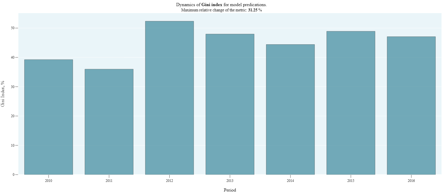
r_4_5_PSI_model
- Technical name: r_4_5_PSI_model
- Description: Population stability index (PSI) for the model
- Tags: risk, scalar
- Requirements:
typing,pandas,numpy
Note:
Automatic division of the score into a specified number of buckets is implemented. In most models, automatic division into a specified number of buckets is acceptable without an additional scale.
An alternative could be division by a master scale in a separate column. The master scale is created by the bank. In risk models, division through a master scale is commonly used.
Execution Logic
Checks the difference in distributions of model predictions (score) on training and testing samples
- For each bucket (division by score values), separately calculate the % of observations belonging to this bucket for train and test
- temp_i = (%test - %train) * ln(%test / %train)
- PSI = sum of temp_i across all categories
Correlation with model quality is negative. The lower the PSI, the better the model
Example of signal bounds: PSI < 0.1 - green,
0.1 < PSI < 0.25 - yellow,
PSI > 0.25 - red
Input Parameters
df_train: dataset with training data (dataframe)
df_test: dataset with test data (dataframe)
predict_column: name of the column with the score (column)
nbuckets: number of buckets into which the score is divided
(int value; default 30)
threshold_yellow: yellow threshold for the traffic light
threshold_red: red threshold for the traffic light (! the column name with predict_column must match in df_train and df_test)
Results
Graph rendering engine: not applicable
Output (long): None
Output (short):
Number: PSI value for the model between train and test
traffic light
Output example (picture): not applicable.
r_4_6_Lift_dynamic
- Technical Name: r_4_6_Lift_dynamic
- Description: Lift Dynamic
- Tags: risk
- Requirements:
typing,pandas,sklearn.metrics,numpy
Note:
-
Execution Logic
Lift values by periods
We group data with period granularity. For each group, we display on a Barchart the lift values for each period:
- lift = [proportion of observations with predict_field=1] / [proportion of observations with target_field=1]
- lift = TPR/PR
Dynamic interpretation: the more stable the Lift, the better
Input Parameters
df: dataset with data for analysis (dataframe)
target_column: name of the target column (column)
predict_column: name of the score column (column)
report_dt_column: name of the date column (column)
period: data granularity
(dropdown - one of the string values: 'month', 'quarter', 'year';
default -'year')
Results
Chart rendering engine: plotly.js
Output (long):
Barchart: Columns correspond to periods Column height - Lift value calculated on observations for the corresponding period The exact Lift value is displayed when hovering over the corresponding column
Output (short):
None
Output example (picture):
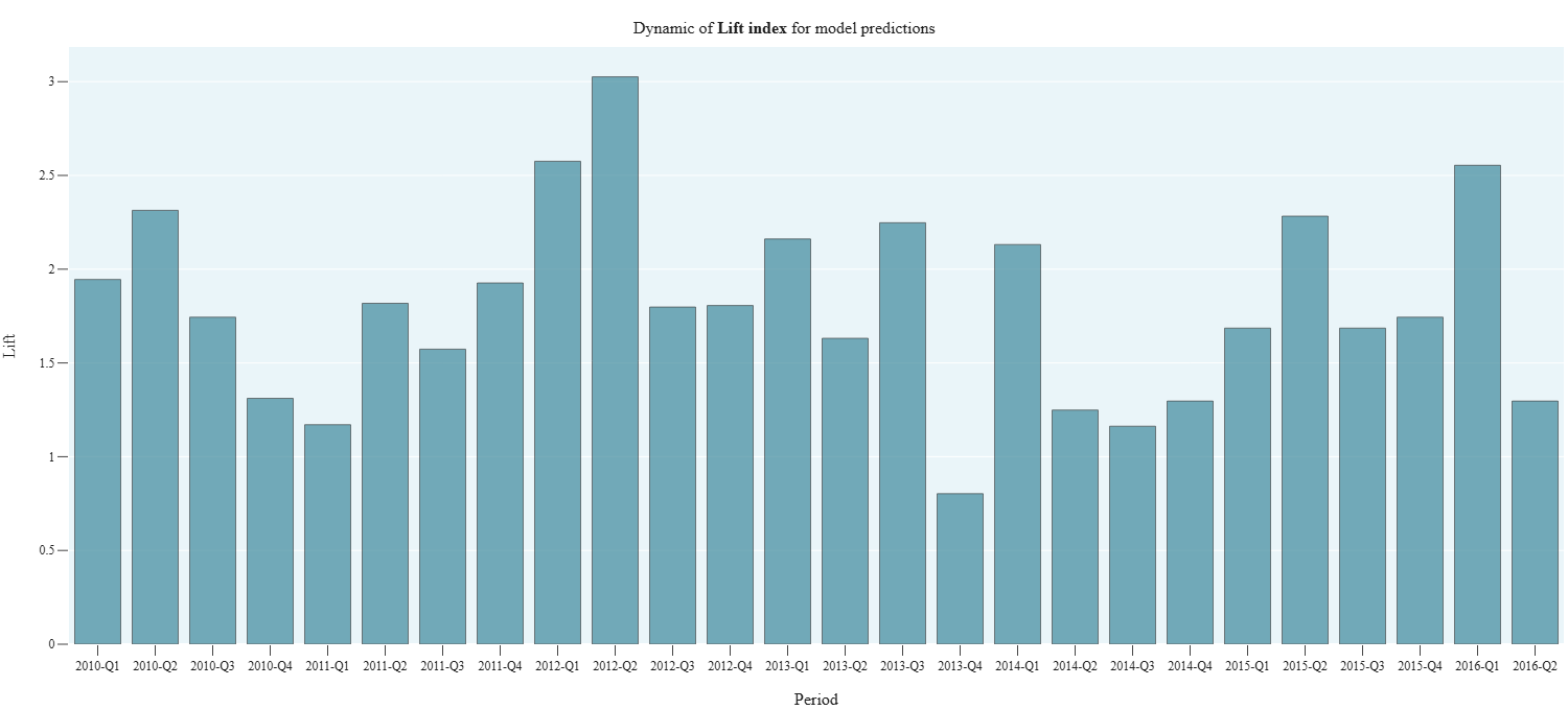
r_4_7_reltv_PR_Curve
- Technical Name: r_4_7_reltv_PR_Curve
- Description: PR Curves train/test. Precision-Recall Curves for train/test and relative change in PRC AUC
- Tags: risk, scalar
- Requirements:
typing,pandas,sklearn.metrics
Note:
-
Execution Logic
([PR AUC_test] - [PR AUC_train]) / [PR AUC_train]
Characterizes the quality of the classification model. The higher (closer to 1) the PRC AUC value, the better the model. In dynamics: the more stable the PRC AUC, the better.
PRC is useful in tasks where class 1 objects are rare but need to be identified.
Input Parameters
df_train: dataset with training data (dataframe)
df_test: dataset with test data (dataframe)
target_column: name of the target column (column)
predict_column: name of the score column (column)
threshold_yellow: yellow threshold for the traffic light
threshold_red: red threshold for the traffic light (! column names for target_column and predict_column must match in df_train and df_test)
Results
Graph rendering engine: plotly.js
Output (long):
PR curves for training and test samples
Output (short):
Number: relative change in PR AUC between train/test
Output example (picture):
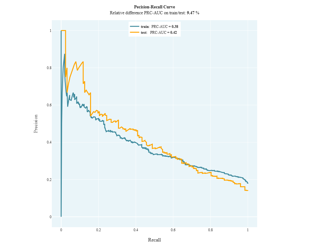
Concentration
r_5_1_HHI
- Technical name: r_5_1_HHI
- Description: Herfindahl-Hirschman Index (HHI) and Barchart with distribution of observations across rating scale grades
- Tags: risk, scalar
- Requirements:
typing,pandas
Note: -
Execution Logic
The Herfindahl-Hirschman Index describes the uniformity of distribution across rating scale grades
- For the i-th grade of the rating scale, we calculate N_i - the number of observations
 , where N is the total number of observations in the dataset
The lower the HH index, the better (the more uniform the distribution across groups)
Example of setting signal bounds:
HHI < 20% - green,
20% ≤ HHI < 30% - yellow,
HHI ≥ 30% - red
Input Parameters
df: dataset with data for analysis (dataframe)
scale_column: name of the column with assigned rating scale grade (column)
threshold_yellow: yellow threshold for the traffic light
threshold_red: red threshold for the traffic light
Results
Chart rendering engine: plotly.js
Output (long):
Barchart:
xaxis: Rating scale grades
yaxis:
Number of observations belonging to the corresponding grade
Output (short):
Number: value of the Herfindahl-Hirschman Index for the selected column, in %
traffic light
Output example (picture):
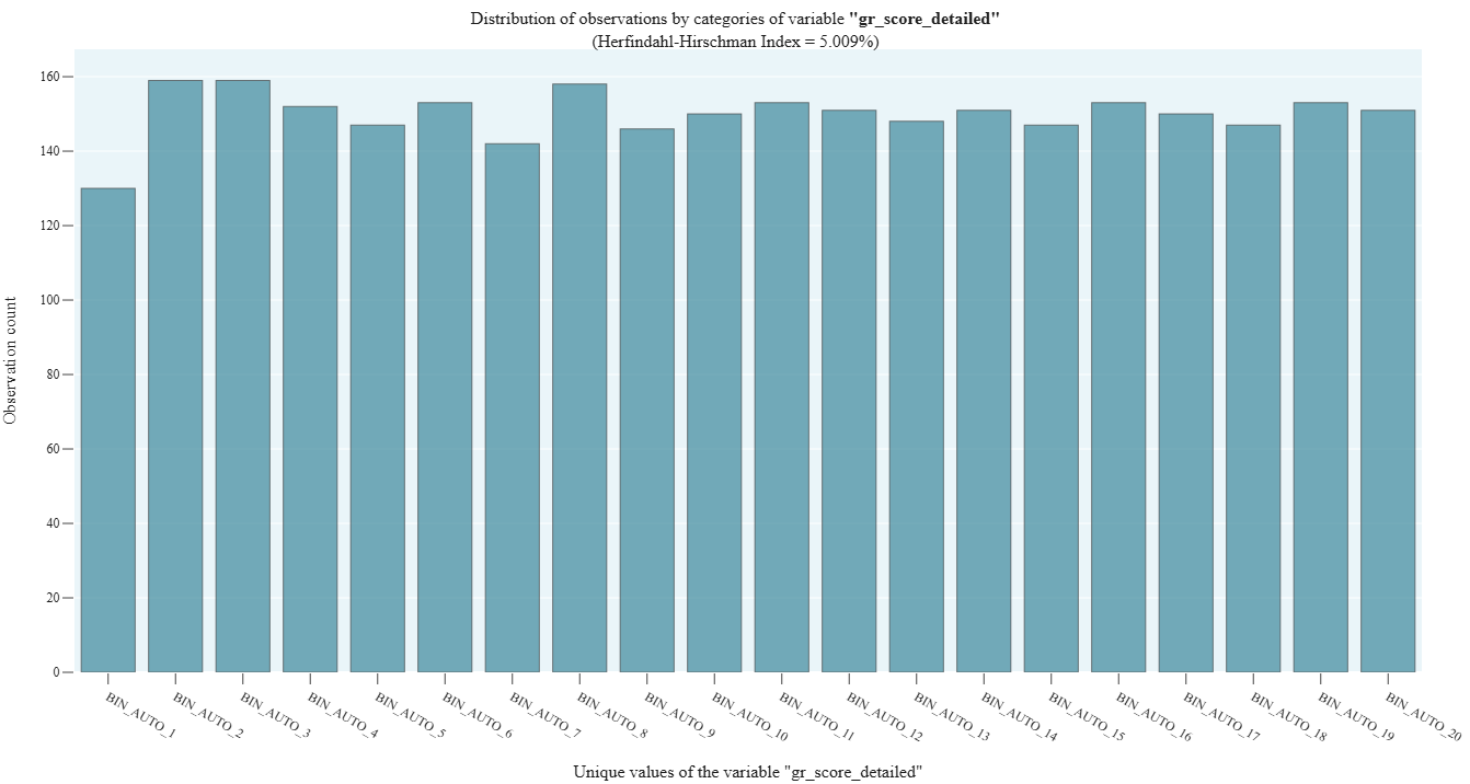
r_5_2_Unique_clients
- Technical name: r_5_2_Unique_clients
- Description: Unique Clients by Bins. Histograms showing distribution across rating scale grades for:
- total number of values,
- number of unique values for the selected column (for example, a column with client IDs)
- Tags: risk
- Requirements:
typing,pandas
Note:
-
Execution Logic
We draw a combined Barchart with:
- total number of observations in each rating scale bucket
- number of unique values in each rating scale bucket
Example of metric application: investigating the distribution of unique clients across the rating scale (we pass the name of the column with client IDs to the field variable. We get: total clients by groups, unique clients by groups)
Input Parameters
df: dataset with data for analysis (dataframe)
scale_column: name of the column with assigned rating scale grade (column)
field_column: name of the column for which we check the distribution of values across grades (column)
Results
Graph rendering engine: plotly.js
Output (long):
Barchart:
xaxis: A pair of columns corresponds to a rating scale grade.
yaxis:
Height of columns: left - number of unique values in the group, right - total number of observations in the group
Output (short):
None
Output example (picture):
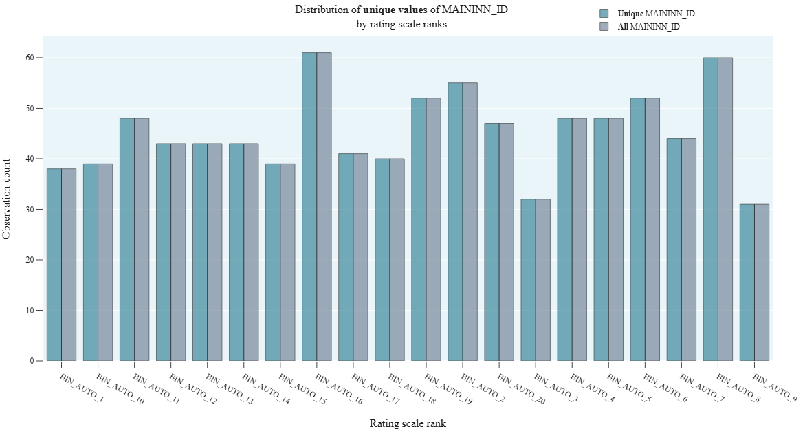
r_5_3_Derivative_Score_Distribution
- Technical name: r_5_3_Derivative_Score_Distribution
- Description: Derivative Score Distribution
- Tags: risk
- Requirements:
typing,pandas,numpy
Note:
-
Execution Logic
DSD typically describes the distribution of derivative scores, which can help in analyzing the sensitivity of the model to changes in input data.
We draw a line graph representing the relationship between the derivative function of the proportion of observations and the score, starting from the value corresponding to the percentile perc_threshold.
Input Parameters
df: dataset with data for analysis (dataframe)
predict_column: name of the column with the score (column)
perc_threshold: percentile threshold for cutting off predict_column values (float)
Results
Graph rendering engine: plotly.js
Output (long):
Line: xaxis: Model prediction values yaxis: Increment of the percentage of model prediction values observations in the dataset
Output (short):
None
Output example (picture):
Calibration
r_6_1_Model_default_rate
- Technical name: r_6_1_Model_default_rate
- Description: Model and actual default rates by rating scale buckets
- Tags: risk
- Requirements:
typing,pandas
Note:
-
Execution Logic
Predicted and actual default rates are calculated as average values of score and target by rating scale grades.
We plot line graphs:
- Average value of target_field for the i-th grade of the rating scale
- Average value of score_field for the i-th grade of the rating scale
The closer the graphs (predicted and actual default rates) are to each other, the better
Input Parameters
df: dataset with research data (dataframe)
target_column: name of the target column (column)
predict_column: name of the score column (column)
scale_column: name of the column with assigned rating scale grade (column)
Results
Graph rendering engine: plotly.js
Output (long):
Array of graphs: xaxis: rating scale grade yaxis: probability of default Graphs correspond to model and actual default rates
Output (short):
None
Output example (picture):
r_6_2_Binomial_test
- Technical name: r_6_2_Binomial_test
- Description: Binomial Test. For each rating scale group, this test checks whether the actual default value (mean target in the group) falls within the confidence interval for the mean prediction value (score) for that group.
- Tags: risk
- Requirements:
typing,pandas,scipy.stats,numpy
Note:
-
Execution Logic
- For the i-th bucket of the rating scale, based on the score_field distribution, we build a confidence interval using the formula:

\(PD_i\) - average score_field for the bucket - For the test to pass successfully, the average target_field must fall within the confidence interval for each bucket of the rating scale
Input Parameters
df: dataset with research data (dataframe)
target_column: name of the target column (column)
predict_column: name of the score column (column)
scale_column: name of the column with the assigned rating scale grade (column)
confidence_level: confidence level (float value; default 0.99)
Results
Graph rendering engine: plotly.js
Output (long):
Array of graphs xaxis: rating scale grade yaxis: probability of default
Output (short):
None
Output example (picture):
Data drift package
dd_1_ADWIN
- Technical name: dd_1_ADWIN
- Description: Calculation of Data Drift using the ADWIN (Adaptive Windowing) method
- Tags: data_drift
- Requirements:
typing,pandas,river - Notes: -
Execution Logic
The algorithm arranges data along a time series. Then the algorithm processes the data using a window method and calculates average values within these windows. If a significant difference is detected between adjacent windows - a data drift event is registered.
More details about the ADWIN method
Input Parameters
df: dataset with data for analysis (dataframe)
field_column: name of the column for calculation (column)
Results
Graph rendering engine: plotly.js
Output (long):
Array of graphs:
- Line chart of column values
- Vertical boundaries marking data drift events found by the algorithm
Output (short):
None
Output example (picture):

dd_2_PageHinkleyTest
- Technical name: dd_2_PageHinkleyTest
- Description: Calculation of Data Drift using the Page-Hinkley method
- Tags: data_drift
- Requirements:
typing,pandas,river - Notes: -
Execution Logic
The algorithm is basically similar to ADWIN (item 1)
More details about the Page Hinkley Test method
Input Parameters
df: dataset with data for analysis (dataframe)
field_column: name of the column for calculation (column)
Results
Graph rendering engine: plotly.js
Output (long):
Array of graphs:
- Line chart of column values
- Vertical boundaries marking data drift events found by the algorithm
Output (short):
None
Output example (picture):
